Announcement

Collapse
No announcement yet.

Badges too far up the butt (if you'll pardon the expression).

Collapse
X
 
  • Filter
  • Time
  • Show
Clear All
new posts

  • Badges too far up the butt (if you'll pardon the expression).

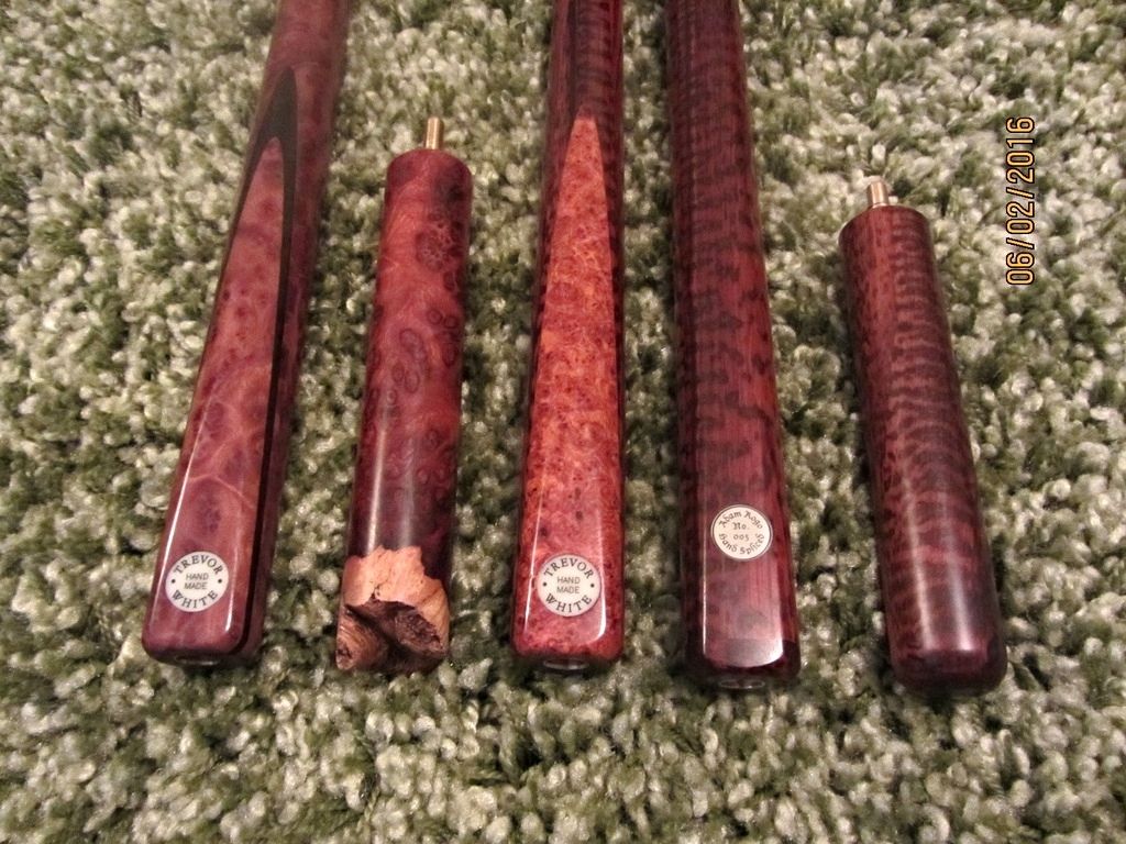
    In the last decade or so I have noticed that cuemakers tend to position their name badges about a centimetre further up the butt than when I was in the business. I presume this trend coincides with the rise in popularity of inserting brass end joints to accommodate a cue extension. Whatever the reason, however, it is aesthetically displeasing to my eye.

    Anybody share this view?

  • #2
    sorry but I don't
    You could be right about the butt joint being fitted could be the reason, but I think the joint is still further up inside the butt than most of the disc badges are on most cues nowadays; so may not be the reason.
    I think the balanced-look of a disc badge being further up from the butt end (approx 1/2" from end) is more aesthetically pleasing to me than some of the old cues with the disc perched in the edge of the butt-end.
    I say some, as there are old cues with discs in the same placement as modern cues
    Of course not discussing rectangle or trapezium or tombstone badges but just round discs.
    The worst is Jimmy White's cue, where the badge is about a foot up the butt due to many alterations over the years

    Can you share a photo or two showing what you dislike/like?
    Up the TSF! :snooker:

    Comment


    • #3
      Have you seen where Jimmy White's badge is on his cue...... now thats so far up the butt !!!

      Comment


      • #4
        Lol Dean... we typed that at same time re Jimmys cue

        Comment


        • #5
          Thank you for the replies, gentlemen.

          I will endeavour to post up a couple of photographs when I get home, Dean, but I'm tapping away on a mobile phone at present and the feat would probably prove beyond what my fat fingers could manage.

          Comment


          • #6
            Originally Posted by mikeyd100 View Post
            Lol Dean... we typed that at same time re Jimmys cue


            toast - when Jim Evans got some new badges he posted a picture of various placements of the discs, it is a fine line between being too low, too high, and just right
            Up the TSF! :snooker:

            Comment


            • #7
              Originally Posted by toastandmarmite View Post
              Thank you for the replies, gentlemen.

              I will endeavour to post up a couple of photographs when I get home, Dean, but I'm tapping away on a mobile phone at present and the feat would probably prove beyond what my fat fingers could manage.
              no worries, be interesting to see what you have in mind
              Up the TSF! :snooker:

              Comment


              • #8
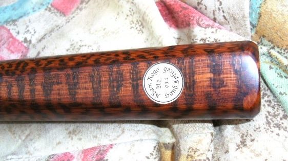
                My snakewood Adam Rogo cue is a long way up but getting used to it

                Comment


                • #9
                  Originally Posted by jrc750 View Post
                  My snakewood Adam Rogo cue is a long way up but getting used to it
                  as ever, a lovely cue that JRC
                  IIRC Adam did a few at that point and a few at a "traditional" placement?
                  Up the TSF! :snooker:

                  Comment


                  • #10
                    I guess we all have differing views on what is (or isn't) aesthetically pleasing, life would be boring if we all thought the same, eh? Personally, I like to see a round badge placed about five millimetres from the end so the wood to the left and right is spaced evenly. I also consider some of the modern circular nameplates to be too large, a particular bugbear being when the disc strays over the edge of the chamfer.

                    I have an old Barracuda Gold medal in my small collection, the small brass badge being particularly nice in my opinion.

                    Comment


                    • #11
                      the badge place looks wrong to me...

                      nice bit of snakewood though?
                      #jeSuisMasterBlasterBarryWhite2v1977Luclex(andHisF ictiousTwin)BigSplash!

                      Comment


                      • #12
                        This isn't my actual Gold Medal, I've just pinched a photograph from Google. My cue features a rounder butt and is crafted from Ziricote, an altogether nicer model but the badge is the same.

                        Comment


                        • #13
                          The size and placement of the Gold Medal badge is perfect to my eye. This newer trend of larger, higher nameplates just doesn't do it for me.

                          Comment


                          • #14
                            Dean.

                            The cue badge featured on your avatar picture is rather innovative, sir. I like it.

                            Comment


                            • #15
                              Originally Posted by jrc750 View Post
                              My snakewood Adam Rogo cue is a long way up but getting used to it
                              Mine too. Good to see 005 and 011 together ( sort off ) again.

                              Comment

                              Working...
                              X